
Exhibition Density & Capacity Calculator
Gallery Specifications
How it works
This tool uses the industry-standard "One-Third Rule" for visual comfort. It calculates how many pieces fit along your linear wall space while maintaining necessary breathing room between frames to prevent viewer fatigue.
Recommendation Results
You walk into a gallery. Is it a museum or a mausoleum? If the walls are bare except for one painting in the center of a vast room, you feel lost. You wander around, checking your watch, wondering if you missed something. Now imagine the opposite. Every inch of wall is covered. Frames touch frames. It’s chaotic, overwhelming, and frankly, exhausting to look at. Neither experience works.
Curating an art exhibition is not just about picking good pieces. It is about controlling how people move through space and time. The single biggest mistake new curators make is thinking more is better. Or worse, that less is automatically sophisticated. The truth is somewhere in the middle, governed by math, psychology, and lighting.
The Golden Rule of Visual Comfort
There is no magic number like "15 paintings" or "30 sculptures." Instead, there is a metric called visual density. This determines whether a viewer can actually process the work without feeling stressed. In commercial galleries and museums, the industry standard relies on the concept of "breathing room."
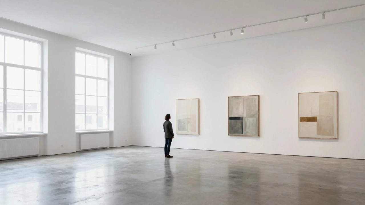
A general rule of thumb used by professional installers is the one-third rule. You should only cover about one-third of your available wall space with artwork. The remaining two-thirds must remain empty. This negative space is not wasted; it is essential. It allows the eye to rest between viewing objects. Without it, the brain gets fatigued, and viewers leave faster.
If you have 100 square meters of wall space, aim for roughly 33 square meters of art. But square meters are abstract. What matters is the linear flow. How many pieces fit along a corridor before a person needs to stop?
Calculating Based on Wall Space and Sightlines
To get a concrete number, you need to measure your venue. Most residential-style galleries or small commercial spaces range from 40 to 80 square meters (430-860 sq ft). Let’s break down what this means for piece count based on typical artwork sizes.
| Gallery Size (sq m) | Small Works (e.g., drawings, photos) | Medium Works (standard canvas) | Large Works (installations, large oil) |
|---|---|---|---|
| 40 - 60 (Small Room) | 15 - 25 pieces | 8 - 12 pieces | 3 - 5 pieces |
| 60 - 100 (Standard Gallery) | 25 - 40 pieces | 12 - 20 pieces | 5 - 8 pieces |
| 100+ (Large Venue) | 40+ pieces | 20 - 30 pieces | 8 - 15 pieces |
Notice the drop-off as size increases. A large installation doesn't just take up wall space; it demands floor space and sightline clearance. If you hang three massive canvases in a 60-square-meter room, the room disappears. The art becomes the architecture, which is fine if that’s your goal, but risky if you want visitors to engage with multiple distinct ideas.
The Psychology of Viewing Time
Why does overcrowding fail? Because human attention has a limit. Studies in environmental psychology suggest that the average person spends between 30 seconds and 2 minutes engaging with a single piece of art in a public setting. If they spend longer, they are deeply engaged. If shorter, they are scanning.
If you cram 50 small photographs into a small room, a visitor might glance at each for 10 seconds. That’s 500 seconds, or over 8 minutes. Sounds reasonable, right? But cognitive load theory tells us that decision fatigue sets in quickly. After looking at 10-15 images, the brain stops processing details and starts skimming. The emotional impact drops to zero.
Conversely, if you show only five large works, a visitor might spend 5 minutes on each. That’s 25 minutes total. For a casual drop-in visitor, that feels like a long commitment. They might rush through, missing the nuance entirely. The sweet spot usually involves a mix that keeps the total viewing time between 15 and 30 minutes for a complete loop.
Format Matters: Paintings vs. Sculptures vs. Digital
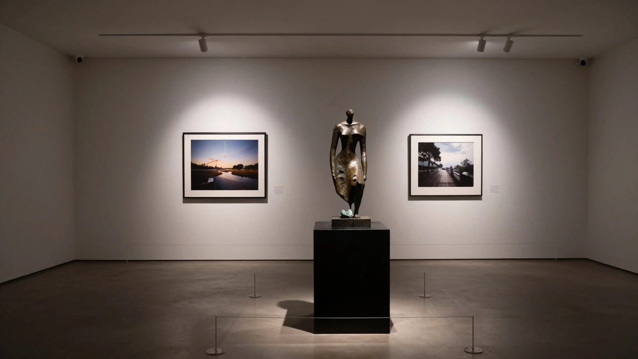
Not all art occupies space equally. A framed drawing hangs flat against the wall. A sculpture projects into the room. A digital projection covers the wall but requires equipment and darkness.
- 2D Works (Paintings, Photos): These are the easiest to calculate. Use the "eye-level" rule. Hang the center of the work at 145-150 cm from the floor. Leave at least 10-15 cm of gap between frames. This spacing prevents visual collision.
- 3D Works (Sculpture, Installation): These require "sightline corridors." You need enough floor space so people don’t bump into the pedestal while others are walking past. A safe zone is 90 cm radius around any object. One large sculpture can effectively reduce your usable wall space by half because it blocks views and narrows pathways.
- Digital/Mixed Media: These often require dedicated zones. If you have a video loop, you need seating or a standing area where people can watch without blocking traffic. Count these as "anchor pieces"-usually, one per room is enough.
Curatorial Narrative Over Quantity
Before you measure walls, ask yourself: What is the story? An exhibition is a conversation. If you invite too many voices (artists or styles) into the room, it becomes noise.
If you are curating a solo show for one artist, you can go heavier on quantity because the visual language is consistent. The eye adapts to the style. However, even then, variety in scale helps. Mix small intimate works with larger statement pieces to create rhythm.
If you are doing a group show, restraint is key. Too many different styles fighting for attention creates visual chaos. Limit the number of artists to ensure each has adequate presence. A common structure is 3-5 artists in a mid-sized gallery, each contributing 4-6 works. This balances equity among creators with spatial logic.
Lighting and Labeling Constraints
Often, the limiting factor isn’t wall space-it’s light. Each piece of art needs specific illumination. Track lights, spots, or natural windows must be positioned carefully. If you add another painting, do you have another light fixture? Do you have power outlets for labels?
Museum labels (didactic text) also take up physical space. They need to be placed near the work but not obscure it. In a crowded layout, labels start overlapping or getting hidden by elbows. Plan for label placement early. If you can’t comfortably read the title without leaning in or dodging someone, the density is too high.
Common Mistakes to Avoid
I’ve seen countless exhibitions fail due to poor spatial planning. Here are the most frequent errors:
- The Salon Style Trap: Hanging art edge-to-edge from floor to ceiling looks impressive in photos but terrible in person. It forces viewers to crane their necks and squint. Reserve this style only for historical archives or very specific thematic statements about abundance.
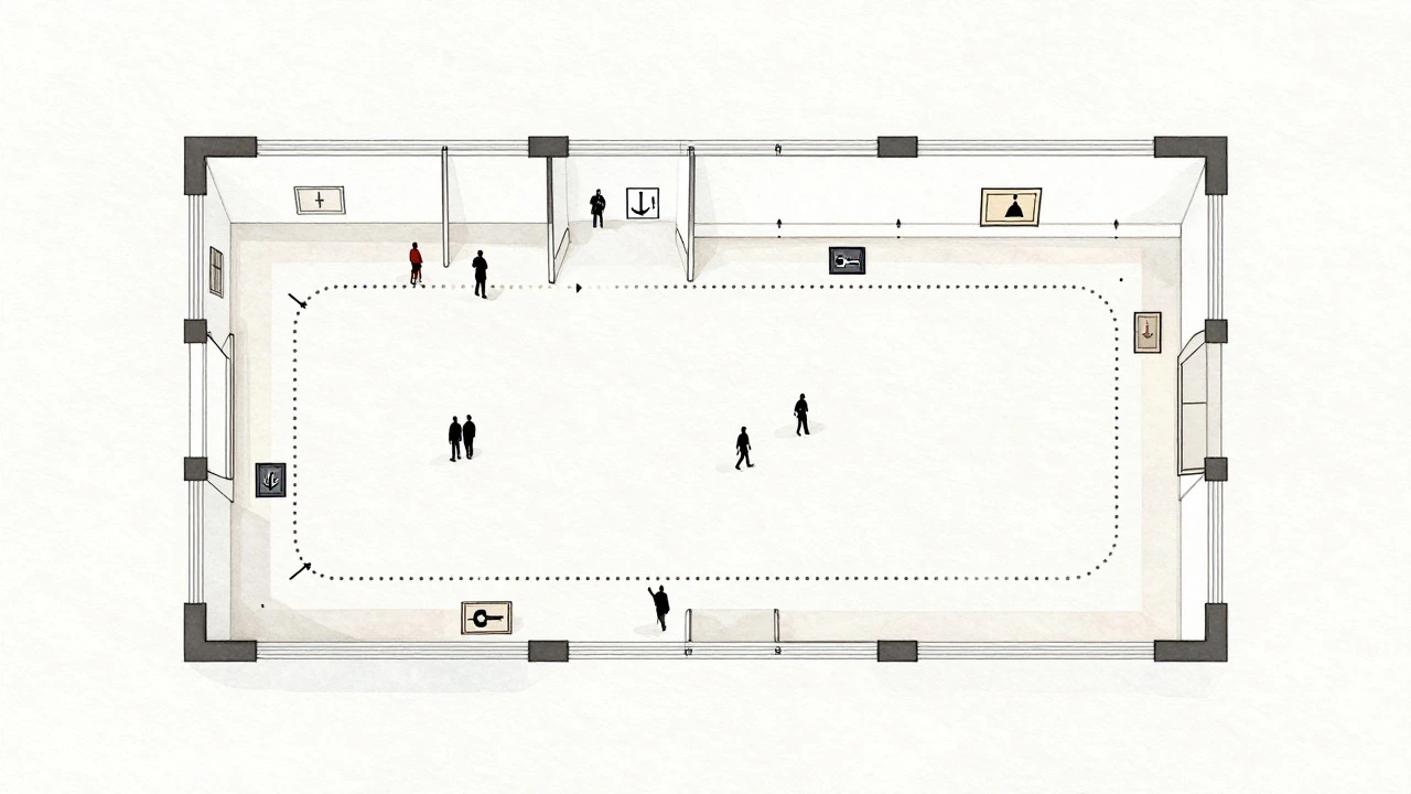
- Ignoring Traffic Flow: People move in patterns. They enter, scan, and exit. Don’t place your best piece in a dead-end corner where few will see it. Place anchor works at entry points and turning corners to guide movement.
- Overlooking Height Variance: Mixing tiny sketches with huge canvases on the same wall can look messy unless deliberately curated. Group similar scales together or use pedestals to elevate smaller works to eye level.
- Forgetting the Exit Experience: The last thing a visitor sees leaves the strongest impression. Don’t end with a cluttered wall. End with a strong, singular image or a clear open space that allows reflection.
Practical Checklist for Your Next Show
Before you drill a single hole, run through this list:
- Measure total linear wall length in meters.
- Subtract doors, windows, and architectural features.
- Calculate 33% of that remaining space for art coverage.
- Lay out mockups on the floor using tape to visualize gaps.
- Walk the path. Does it feel rushed or spacious?
- Check sightlines from every angle. Can you see the back wall from the front door?
- Count your light sources. Do you have enough for every piece?
- Review the narrative. Does the sequence tell a coherent story?
Ultimately, the number of artworks is secondary to the quality of the experience. A gallery with ten perfectly spaced, well-lit, emotionally resonant pieces will always outperform one stuffed with fifty mediocre ones. Curate for the human eye, not the inventory sheet.
How many artworks should I put in a small home gallery?
For a small home gallery (under 40 sq m), aim for 8-12 medium-sized pieces or 15-20 smaller works. Focus on creating focal points rather than covering every wall. Leave at least one wall completely bare to prevent claustrophobia.
What is the ideal distance between two framed paintings?
The standard gap between frames is 10-15 cm (4-6 inches). This provides enough visual separation to distinguish each piece as an individual entity while maintaining a cohesive group appearance. Larger gaps (20+ cm) are better for emphasizing isolation or importance.
Can I hang art above furniture in an exhibition space?
Generally, avoid hanging art directly above sofas or benches in formal exhibitions unless the furniture is part of the installation. It restricts viewing angles and makes the art feel secondary to the decor. Keep seating areas separate from wall displays to maintain clear sightlines.
How does lighting affect the number of artworks I can display?
Lighting is often the hard limit. Each piece typically requires its own dedicated spotlight or track head to avoid shadows and glare. If your electrical setup only supports 10 lights, you should display no more than 10 major works, regardless of wall space availability.
Is it better to have fewer large pieces or many small ones?
It depends on your goal. Fewer large pieces create a dramatic, immersive experience and encourage slower, deeper engagement. Many small pieces allow for rapid comparison and series exploration. For first-time exhibitions, a mix is safest: 70% medium/small works with 30% large anchors.